At Hollywood Monster, we’ve built our name on impact. Big graphics, towering hoardings, stadium wraps, venue takeovers – the kind of work you can’t walk past without noticing. It’s our DNA. But here’s the truth: even when you’re already delivering at that scale, there’s always a part of us that wonders… what if we pushed it even further?
That’s how this story started. One afternoon at Monster HQ, the marketing team had an idea. They’d been looking at some of our favourite installs – projects we’re hugely proud of – and thought: “These are already bold, but what if we reimagined them with different finishes?” Gloss. Metallic. Neon.
Of course, we weren’t about to repaint a mural or re-wrap a billboard just to see what it looked like. So instead, we brought in a bit of AI wizardry. With some clever tools, we mocked up our existing installs with new finishes. It was a bit of fun at first, a little office mischief, but the results had us grinning. And, more importantly, they got us thinking.
Because sometimes it takes a spark of playfulness to remind you how far you can stretch an idea.
Why Impact Matters More Than Ever
If you’ve been out in a city recently, you’ll know exactly how noisy the world has become. Everywhere you turn, there’s another advert, another sign, another attempt to grab your attention. Most of it washes over you. A glance, a blink, and it’s forgotten.
But then there are the moments where you stop. You actually look. And later, you remember. Those moments don’t happen by accident. They’re built. They’re designed. They’re crafted to stand out.
Impact isn’t just about size. It’s about presence. The way something owns its space. The way it makes you feel something – energy, prestige, excitement – without you even realising why. That “why” is where finishes come in.
We already know large-format print can dominate. A 40-foot banner in the middle of a city skyline will always draw eyes. But finishes are what give that banner depth, texture, and a sense of being alive. They turn “seen” into “felt.” And in a world where attention is the hardest currency to earn, that difference is priceless.
Playing With Finishes
So what exactly did we try in our AI experiments? We started with gloss. Imagine taking a flat colour and giving it the kind of wet-look shine you get on a freshly waxed car. The moment the light hits, the surface comes alive. Colours bounce back at you. Shadows pick up detail. Suddenly, what was good feels electric.
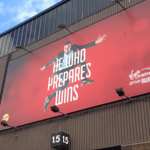
Then we tried metallic. Flat red became chrome-like. It shifted and reflected with every movement, catching the light in ways you don’t expect from print. Metallic isn’t subtle – it’s prestige. It makes you think of car showrooms, luxury packaging, things that are built to last.
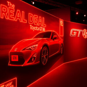
And finally, we had fun with neon. Neon doesn’t whisper. It shouts. It buzzes. It glows like a sign pulling you in from across the street. On an exhibition stand, it’s the finish that says: “come over here, this is where it’s happening.”
Each finish told a different story. Each one shifted the mood of the design completely. And each one had us looking at work we already loved with fresh excitement.


Real Installs, Reimagined
The Virgin Trains billboard is a perfect example. On its own, it’s bold: a rich red background, sharp graphics, unmissable in its scale. But when we gave it a metallic twist, something changed. Suddenly it wasn’t just red – it gleamed. It reflected sunlight, shifting as the day went on. It became less of an advert and more of a landmark.
Then there was the Toyota GT86 stand. As it was, the stand already filled the hall with presence. But when we layered neon accents onto it, the whole thing pulsed with energy. It felt like the car itself was alive in the room, revving against the walls. It was the same stand, but it carried a completely different charge.
And the Virgin Media mural. Already one of our favourites, already a crowd-stopper. But with gloss added to the swooshes, the whole piece looked lacquered, like wet paint catching the light. Suddenly it wasn’t just an image – it became tactile. You wanted to run your hand across it. People would stop, snap photos, share them.
None of these experiments were about fixing anything. They were about asking: what happens when you take something that works, and see how much further it can go?


Why It Matters for Brands
It’s tempting to think of finishes as decoration. We don’t. They’re a language. Metallic speaks prestige. Gloss speaks vibrancy. Neon speaks energy. When people see them, they don’t just process the message – they feel the brand.
That’s what makes finishes powerful. They don’t just change how something looks; they change how people connect with it. A glossy mural doesn’t just catch light, it tells you this is alive, current, buzzing. A metallic wrap doesn’t just shine, it tells you this is premium, crafted, worth your attention. Neon doesn’t just glow, it tells you this brand is the centre of the action.
And in markets where everyone is shouting at once, those subtle signals make the difference. They’re the line between a passer-by forgetting you in seconds and a passer-by snapping a photo, posting it online, and remembering you for weeks.
What We Learned
The lesson for us wasn’t that AI can make our work better – it can’t. What it can do, though, is broaden what’s possible. It gives us a way to test ideas quickly, to play without boundaries, to spark conversations that might never have happened otherwise.
And here’s the best part: it’s not just for us. Clients can experiment too. If you’ve ever wondered what your brand would look like in gloss, or how your campaign might feel with a metallic twist, or what happens when you throw neon into the mix, we can mock it up together. That’s part of the fun.
At Hollywood Monster we’ve never been scared of a challenge. If anything, we chase them. We love the “what ifs,” the mischievous ideas, the experiments that turn into breakthroughs. This project was proof of that.
Mischief, With Purpose
So yes, this whole thing started as a bit of mischief. The marketing team wanted to play. But it reminded us of something important. Impact is never an accident. It’s built from scale, creativity, and the courage to keep pushing.
We’re proud of the installs we deliver every day. They already stop people in their tracks. But with a little imagination – and a little help from AI – we’ve shown they can be pushed even further.
So if you’re ready to go from bold to unforgettable, come and talk to us. We’ll bring the scale, the craft, the ideas… and yes, maybe just a bit of mischief too.
Hollywood Monster. Never scared of a challenge. Always up for Monster Impact.
#MonsterImpact #LargeFormatPrint #PrintThatPerforms #HollywoodMonster


For signage that goes beyond ordinary finishes
For finishes that turn heads, stop scrolls, and get people talking, come to Hollywood Monster. We’ll push your brand from bold to unforgettable, with a little craft, a little creativity, and just enough mischief.